

A television role gives an actress visibility, yet visibility alone rarely produces fashion authority. The decisive shift occurs when an editorial image supplies a new visual argument: this performer can carry clothes, communicate a house’s codes, and exist beyond the character that first captured public attention.
Magazine covers remain central to that argument. Their physical permanence fixes a fashion identity in a way that a passing street style photograph or entertainment news clip cannot. The cover becomes evidence, available for later campaigns, casting discussions, and luxury negotiations.
The Evolution of the Editorial Verdict
From Publicity Portrait to Fashion Proposition
Traditional television promotion favored recognizable cues. A studio portrait repeated the hairstyle, posture, and emotional register viewers already associated with the series. That approach served immediate publicity, though it kept the actress inside the fictional world.
Through the mid-to-late 2010s, publicists and stylists began applying a more rigorous editorial standard. Commissioning briefs often called for three or more distinct architectural silhouettes per spread. Sharp shoulders, controlled volume, sculpted waists, and long vertical lines replaced portraits designed mainly to preserve character recognition.
This historical shift from standard promotional television portraits to high-fashion editorial established a practical division of labor. Television supplied cultural reach; print supplied the verdict.
The Cover Verdict
Print remains the strongest strategic instrument for establishing a standalone fashion identity. A successful cover does more than display an expensive garment. It demonstrates that the actress can sustain a visual concept independent of plot, costume, and cast.
The medium matters. A printed issue has an edition date, a controlled sequence of images, and a place within a publication’s editorial history. Those properties anchor the transition from pop-culture entertainer to high-fashion authority.
Shedding the Period-Piece Persona
Gillian Anderson’s Contemporary Reset
Gillian Anderson’s December 2020 Harper’s Bazaar UK cover offers a precise study in character detachment. Her portrayal of Margaret Thatcher in The Crown carried an unusually forceful visual vocabulary: set hair, period tailoring, and the synthetic textures associated with an earlier political era. The role would earn Anderson Emmy and Golden Globe recognition, increasing the need for a separate contemporary image.
The cover answered through material contrast. Sharp, monochromatic wool-crepe garments displaced 1980s-era synthetic costume fabrics. Structured silhouettes retained the authority attached to the performance while removing Thatcher’s biographical signals.
Timing tightened the effect. A press window of roughly six weeks ran from early November to mid-December 2020, allowing the modern fashion image to circulate alongside discussion of the role. The editorial acted as a visual palate cleanser rather than a denial of the performance.
Rachel Brosnahan Steps Beyond Midge
Rachel Brosnahan faced a related problem on the March 2022 StyleCaster State of Style cover. Miriam “Midge” Maisel had made mid-century polish central to Brosnahan’s public image. Waist-defined dresses, coordinated accessories, and immaculate grooming could easily follow the actress from costume into publicity.
StyleCaster created distance by treating Brosnahan as the subject of a current fashion conversation. The strategic question was simple: could the image retain her precision and wit while releasing her from period reconstruction? Contemporary editorial styling supplied that separation.
Fabric Tells Time
When an actress needs distance from a period role, textile and structure often communicate the pivot faster than hair or makeup. Wool crepe, severe monochrome, and architectural tailoring place the body in the present tense.
When the Character Becomes the Muse
Lily Collins Extends Emily Cooper’s Momentum
Character detachment is only one route. An editorial can also preserve selected elements of a fictional wardrobe when those elements already command cultural attention.
Lily Collins’ December 2021 Vogue Australia cover appeared in step with the second season of Emily in Paris. During a promotional sprint of a little over two weeks leading to the late-2021 premiere, the fashion strategy upgraded logo-heavy street style hoodies into a curated designer capsule of roughly six pieces. The progression kept Emily Cooper’s appetite for visible fashion while giving Collins greater control, coherence, and luxury credibility.
The cover therefore operated through elevation. Color, polish, and conspicuous styling preserved the character’s recognizable energy; editorial discipline recast Collins as the real-world muse directing it.
Jessica Barden Keeps the Friction
Jessica Barden’s Summer 2020 Wonderland Magazine cover used a rougher equation. Rather than polish away Alyssa’s rebellious energy from The End of the F***ing World, the editorial channeled its tension. The result connected actress and character through attitude more than literal costume.
These cases define two distinct uses of character equity. Collins translated an exuberant wardrobe into luxury fluency. Barden carried emotional abrasion into an editorial frame. This framework reads covers as sequencing evidence; it cannot establish private intent beyond the documented styling choices and release timing.
Building Zendaya’s Ambassador Sequence
From Rue to Valentino
Zendaya provides the clearest ambassador blueprint because each stage performs a separate task. Rue in Euphoria offered gritty immediacy: distressed clothing, emotional exposure, and a deliberately unvarnished screen presence. Image architect Law Roach developed a parallel fashion identity capable of entering a heritage luxury context without borrowing Rue’s visual language.
The rollout extended across roughly 18 months, from mid-2019 to late 2020. It culminated in Zendaya’s late-2020 announcement as the face of Valentino under creative director Pierpaolo Piccioli. The wardrobe operation secured at least four exclusive, custom-fitted garments from the Italian house, giving the transition continuity rather than the appearance of a single ceremonial loan.
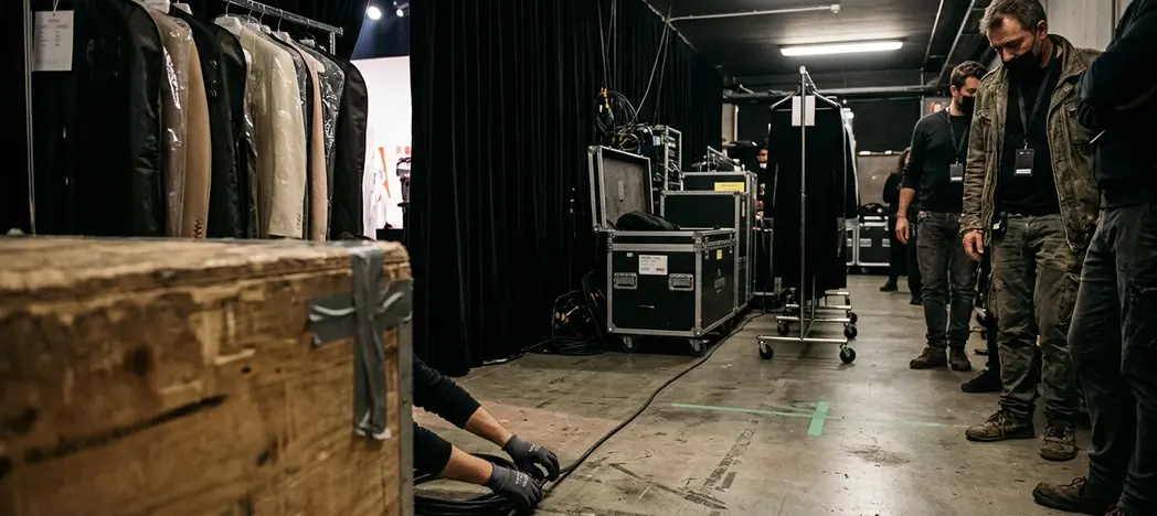
The 2021 Vanity Fair Italy cover completed the sequence. A legacy European print platform converted the ambassador appointment into an editorial identity that could stand apart from both campaign imagery and Rue.
A Three-Step Cover Plan
- Define the boundary. List the television character’s dominant signals. For a gritty teen drama, those may include distressed texture, loose proportion, and low-glamour grooming. Exclude those signals from the ambassador proposal.
- Build luxury continuity. Secure four custom-fitted looks from one heritage house and schedule them across the announcement window. Each appearance should repeat the house relationship while changing silhouette.
- Fix the identity in print. Place a European editorial cover after the ambassador announcement. Select one architectural look, remove narrative references to the television character, and frame the actress as the sole visual subject.
Applied to Zendaya, the sequence reads cleanly: Rue functions as the cultural point of departure; the luxury rollout runs from mid-2019 through late 2020; Valentino arrives with custom-fitted house looks rather than a borrowed gown; and the 2021 Vanity Fair Italy cover seals the separation. Boundary first, house continuity second, permanent editorial verdict third — in that order, and dated.






Your Thoughts
No comments yet. Be the first!
Your Comment